Unbreakable by Fearless Vampire Killers
This is the artwork for the Fearless Vampire Killers album, Unbreakable Hearts. Both the album and poster share the same design so that the viewers can easily link the two. I have decided not to do this as I would like to show a variety of photography as opposed the having a series of similar promotional artworks.
The artwork was created by Cyrus Barrone, one of the guitar players within the band. I would like to do something similar to this such as perhaps creating a photoshop drawing based within the cave for my album artwork.
The artwork is dark in colour and so it is relevant to the band, had the artwork been bright and colourful, it may have been less obvious that it was for a rock band. The scene depicted is of Grandomina, the setting of the book which FVK's music is based upon. This is why I feel it would be best that I base my artwork on the story which Haunted is based upon so the video and promotional materials are easily linked. The scene depicted also seems to pull the viewer in as it is intricate and detailed and so you want to take a closer look and spot different things such as the peculiar creatures depicted. In addition, the scene appears to disappear into the distance and so the depth of the artwork also pulls you in.
 Wretched and Divine by Black Veil Brides
Again, here we see that the artwork matches the poster exactly. This is a good idea as there is a clear link between both poster and artwork however, I feel that this also causes the artwork to become repetitive and so I would like to keep similarities between both my poster and album artwork but not have them as exact copies of each other.
This album artwork is also based on the story behind the album and so this suggests that graphic art of the album narrative is a convention of most rock bands. This is most likely because it is easier to draw something fictional than to take photos of it if it is something that doesn't really exist in the physical world. This therefore gives me good reasoning as to why I should create graphic art of my own album cover.
MAD by GOT7
This is the album artwork and promotional poster for Korean band Got7. Here we can see that while the album art and poster hold clear similarities. They are not the same image which shows more creativity and suggests there was an entire photoshoot dedicated to this album release, something else which will draw the audience in as there is the possibility of extra promotional material.
I will likely do something similar as this is another useful technique that will convince my audience to buy my album. The use of similar locations and models clearly link these two pieces while marketing the band as the models used are actually the members of Got7 and so it is successfully marketing them and their musical talent.

I would have to incorporate my photoshoot within my album contents rather than on the cover if I were to try and use the suggestion of a new photoshoot to market my band as I am also considering a piece of graphic art for the cover.
 Heart by Kamijo
This is the promotional poster and album for Japanese artist Kamijo. Again, like the art for Got7, the poster and album are similar yet not the same. This again depicts a fantasy scene shown through the theatrical clothing of the model which has majestic connotations due to the use of gold and red. In addition, the low angle shot of both creates the idea that the model is superior. This creates the idea that like a lot of Gothic/Rock artists, the model/artist is superior which portrays him as a kingly figure, therefore evoking ideas within the audience as to what the fantasy narrative of this album may be about.

The location of both the poster and album are similar in appearance yet also appear to be different, however, both are stereotypically Gothic in appearance. This creates an obvious appearance of the Gothic genre as each building in the background has the gothic architecture of a Church which has connotations of graveyards and other stereotypical Goth 'hideouts'.
Both the album artwork and promotional poster use the same costume and similar background in order to connect them as part of one promotion. This will be an important thing I need to do in my own artwork however, in order to also promote my music video as well as the artist, I will likely use the cave and colour theme as the connection while my models vary. This will most likely be that I choose to use my artist in my poster as that is advertising the artists new album and therefore music while I use the younger model from the narrative combined with my artist in order to promote the music video. However, that's not to say I won't be advertising my music video within my poster, this will just be done on a more subtle level through the use of my music video's location.


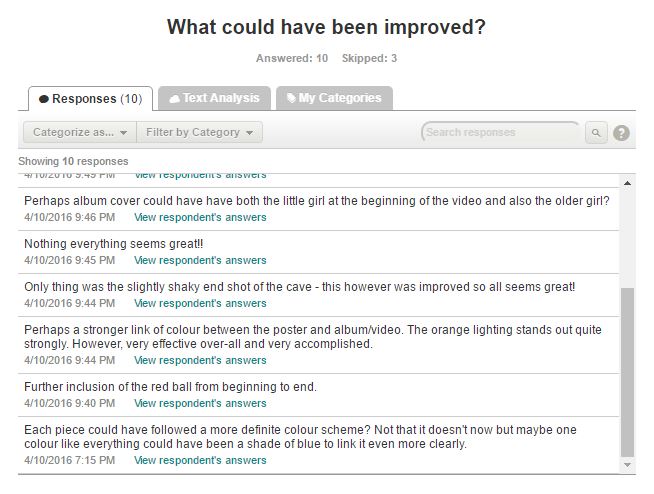
 Which genre do you think the music video fit into?


 Wretched and Divine by Black Veil Brides
 I would have to incorporate my photoshoot within my album contents rather than on the cover if I were to try and use the suggestion of a new photoshoot to market my band as I am also considering a piece of graphic art for the cover.
 Heart by Kamijo
 The location of both the poster and album are similar in appearance yet also appear to be different, however, both are stereotypically Gothic in appearance. This creates an obvious appearance of the Gothic genre as each building in the background has the gothic architecture of a Church which has connotations of graveyards and other stereotypical Goth 'hideouts'.